Thank you for subscribing

You’ll be sent the latest news, exclusive offers and competitions to your inbox.

How to style your home like a professional

Woman styling couch
RACV

October 30, 2024

Get your house ready for sale with these savvy interior styling tips.

If you’re thinking about selling your house, then it’s time to start looking at how to best present your property for sale.

Clever decorating tricks can help bring out a home’s strengths and give potential buyers a better indication of room size. A well-styled room can also help paint a picture of how different spaces can be used.

The first impression potential buyers have of your property is through photos, and this is where good styling can make all the difference. 

The photos taken for your real-estate campaign are really the first point of contact with a potential buyer. Once your house is looking pristine for the photos try to keep it that way for the property inspections.

Here are a few handy tips to get you started and help you style your home like a professional. 


Seven expert interior styling tips to get your house ready for sale

Remove personal items

Start by making the home less about you.

Take down any photos of family and friends, especially ones displayed in a gallery-wall format, and replace them with a single artwork or nothing at all. You want a buyer to form their own attachment with the home by picturing themselves living there. 

Don’t forget to remove party invitations, school notices and kids’ drawings from the fridge door, so it looks nice and clean. Also pack away framed diplomas, certificates, degrees, sports medals, trophies and memorabilia, often displayed in studies and bedrooms.   

Don’t polarise your buyer

Artwork may breathe life into a room, but choose wisely and steer away from imagery and colours that can be too divisive. 

Watercolours can have a softening effect on a room, and blues and greens tend to make people feel calm and relaxed. But don’t feel compelled to have something on every wall – it’s okay to leave some of them blank. Again, it gives the potential buyer the opportunity to imagine themselves in the space.

Get rid of clutter

Rooms must be neat and as far as styling goes, think simplified and pared back. Don’t be tempted to overload coffee tables and bedside tables with knick-knacks and books, keep decor touches on kitchen and bathroom benchtops to a minimum and, importantly, look at decluttering cupboards.

One thing people look for in a home is good storage, so they may open up every cupboard. If you have jam-packed things in, they will feel like there’s not enough storage.

More: How to organise your pantry like a pro

Woman looking at photo frames
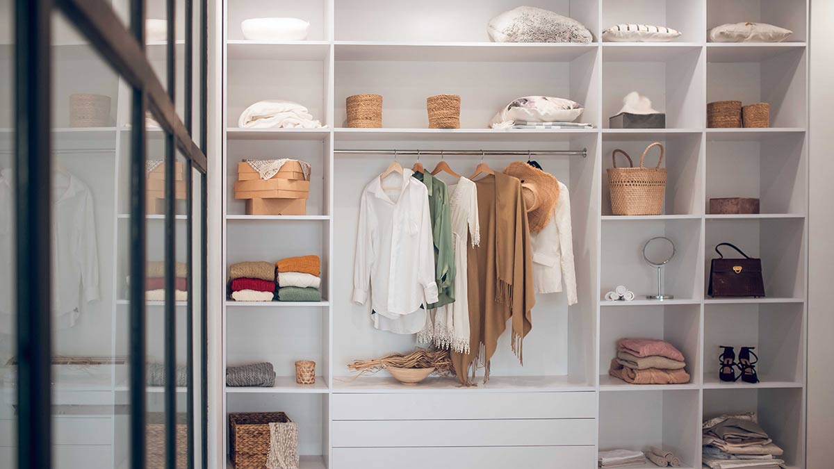
Photo of an organised wardrobe
Woman putting on clean linen

Take down any photos of family and friends. Photo: Getty

Declutter cupboards and wardrobes to give the illusion of more space. Photo: Getty

White linen in bedrooms looks crisp and won't distract buyers.

1 of 3

Choose a neutral palette

As a rule of thumb, keep your base palette neutral and then bring in hints of colour with accessories to warm up the look. A neutral palette will often open up a space and make it feel light and airy. 

White linen is best in bedrooms because it looks crisp and clean and won’t distract a buyer. Having highly patterned linen can also be quite overwhelming in photos and close the space in.

Add some greenery

When working with a neutral palette rooms can sometimes start to look clinical or prescribed, but adding greenery is a handy trick to ensure the space continues to feel engaging and fresh. Touches of greenery will layer a space with some life and can be used to add height and texture. 

Bathrooms, with their expanses of tiles and glass, will definitely benefit from some plant life to rescue the space from feeling cold and uninviting. Add a small plant on the vanity paired with a stylish soap pump, or sitting one on the bath hob. 

Create focal points

Decorative focal points are good ways to anchor a room but don't go overboard with too many hero pieces or you’ll upset the balance of the space. When there are too many standout pieces nothing feels special and people can start to become a little overwhelmed and uncomfortable.

A smartly placed focal point, such as an occasional chair or an artwork, will draw your eye to a particular area of interest or feature, or a key selling point of the room.

Accentuate space and light

Avoid positioning a large piece of furniture, such as a sofa, in front of a window because it will interrupt the flow of natural light and block garden views. For a loungeroom, try two armchairs or a low-lying piece of furniture instead. It looks lighter and you can see past them more easily into the garden.

Lamps and overhead lights are an important way to brighten a room and create a sense of mood. 

More: Best lightbulbs to save energy and money

RACV Trades can help you around the home

Discover more